Juxtaposition Poster
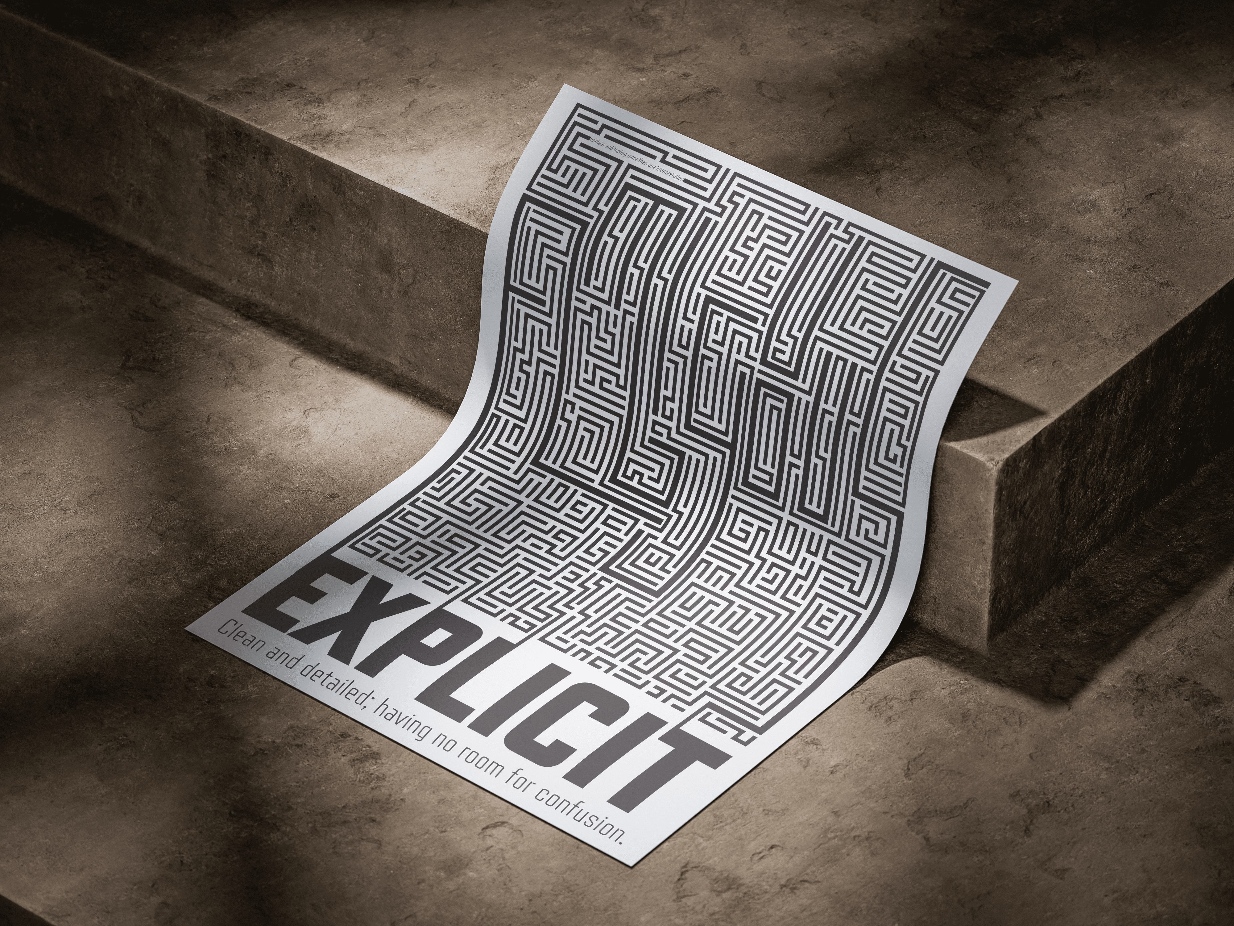
I intentionally made 'Ambiguous' difficult to read by blending it into the design, using heavier stroke weights to keep it somewhat distinguishable and invite interpretation. In contrast, I used a clean, geometric typeface for 'Explicit' to clearly communicate its meaning and create a strong visual and conceptual contrast."
Client
Type I
DELIVERABLES
Design a poster of a Juxtaposition that would create a unity between the connotative and denotative components of type design.
Year
2024